
The Corten Branding Story: How a Custom Pink Changed Everything
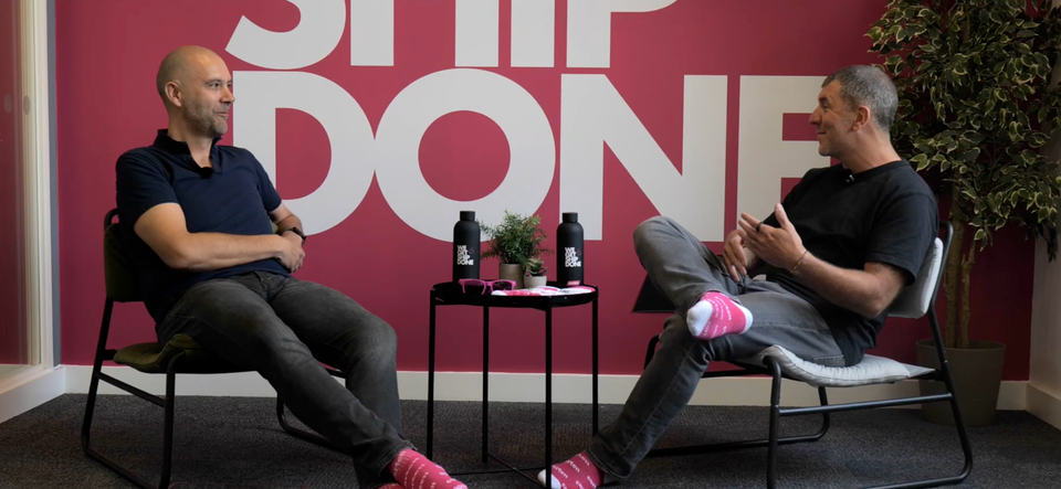
When Rob Donald walked into the office one morning and announced he was changing the company colour to pink, co-founder Sam Yauner’s reaction was simple: “Okay, great.” What followed was a branding decision that would come to define one of the UK’s most distinctive independent freight forwarders and spark a global sock phenomenon that nobody saw coming.
In the first episode of Chatting Ship with Corten, Sam and Rob sit down to tell the story behind the brand the custom colour, the socks, the smiley face, and why dropping “Logistics” from the name was one of the best decisions they ever made.
Standing out in a sea of blue and green
The freight industry isn’t exactly known for bold visual identity. Blues, greens, oranges - safe, corporate, forgettable. Rob saw that as an opportunity.
“We need to stand out. How can we do that? Let’s do something completely different.”
But this wasn’t a case of picking a colour from a swatch. Rob spent three weeks developing a pink that was entirely his own, no Pantone reference, no off-the-shelf equivalent. He’d been looking at design agencies and hairdressers, drawn to their dynamic, high-contrast websites. He wanted that same energy in a freight company.
The closest thing to the finished colour? The wall of the Corten office. “It’s more like a salmony hot pink,” Rob explains. “We call it cotton pink.” Unique to Corten, and utterly unmistakable. The clothing is a hot pink approximation, but the website colour, that’s something else entirely.
First impressions count
The results spoke for themselves early on. When Sam and Rob asked new clients why they’d chosen Corten, the answer kept coming back the same way: “I liked your brand. I liked the colour. I liked the website.”
In an industry built on trust and reliability, a bold visual identity was doing serious commercial work. As Rob puts it: “First impressions kind of work.”
To this day, the majority of freight forwarders still use blues and greens. Corten’s cotton pink stands alone and that’s exactly the point.
The socks that went global
If the pink is Corten’s foundation, the socks are its folklore.
It started at a trade show at the NEC around 2010, when Sam and Rob spotted another company handing out branded socks. Sam came back and said they should do the same. Rob, true to form, came back with a stack of designs. Now on their second version, Corten have given out nearly 3,000 pairs - and they’ve taken on a life of their own.
“People WhatsApp us almost daily wearing a pair of our socks. From all over the world.”
Messages come in from Colombia, South Africa, Brazil. Suppliers send photos of themselves on the job, socks on show. At an expo in Brazil earlier this year, strangers were approaching Rob just to ask if they could have a pair. Rob’s even trying to get #CortenSocksRocks trending on LinkedIn. Watch this space.
We Get Ship Done
The evolution of the Corten brand didn’t stop at the colour. Rob made the bold call to drop “Logistics” from the name, Corten alone was enough. Then came the smiley face. And then the catchphrase that perfectly captures the company’s personality:
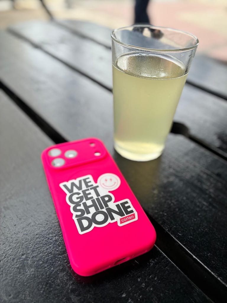
“I always want to be a bit different,” Rob explains. “Be memorable.” After nearly 17 years, the Corten brand has become something Rob is genuinely proud of — and fiercely protective of. It’s not just a logo or a colour. It’s a badge of honour for everything the business stands for.
“I think you’ve done a great job on the branding, mate,” says Sam.
Hard to argue with that.